Downloadable Files
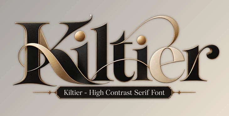
You can download Kiltier - High Contrast Serif Font for free from the end of this page.
Kiltier
Kiltier - High Contrast Serif Font combines strong contrast between its letterforms with a refined serif style designed around both contemporary aesthetics and timeless elegance. With multiple weights, roman and italic styles, stylistic alternates, swashes, and variable font options, it provides designers with considerable flexibility when building distinctive typography.
A High-Contrast Serif with 14 Weights
One of Kiltier's main strengths is its extensive weight selection. The typeface includes 14 weights, giving designers a broad range of choices when establishing hierarchy or changing the visual character of a composition.
These weights are available in both roman and italic styles. This combination makes it possible to maintain a consistent typeface across different parts of a design while introducing variation through weight and slant rather than switching to another font family.
Kiltier's high-contrast serif construction gives the letterforms a distinctive appearance, while its combination of contemporary details and traditional elegance makes typography itself an important visual element of the composition.
Stylistic Alternates for More Distinctive Typography
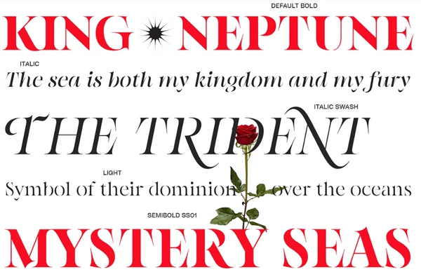
Kiltier includes a wide selection of stylistic alternates. These alternate characters provide additional ways to shape the appearance of words, headlines, and other prominent text.
Rather than being limited to the standard character forms, designers can select alternatives that better suit the visual direction of a particular composition. This is especially relevant when typography needs to feel more individual or sophisticated while remaining within the same type family.
The alternates also complement Kiltier's broad selection of weights, providing control over both the overall typographic weight and the appearance of individual characters.
Italic Styles with Elegant Swashes
The italic side of the family adds another decorative element through elegant swashes. These extended forms introduce a more expressive and artistic quality to the typography.
Swashes can be particularly relevant for compositions where selected letters or words need additional visual character. Because they are incorporated into the italic style, they work as part of Kiltier's broader typographic system rather than as separate decorative graphics.
This creates a useful distinction between the roman and italic designs: roman styles can establish the main typographic structure, while italics and their swashes can introduce a more refined or expressive accent when required.
Variable Fonts for Fine-Tuned Control
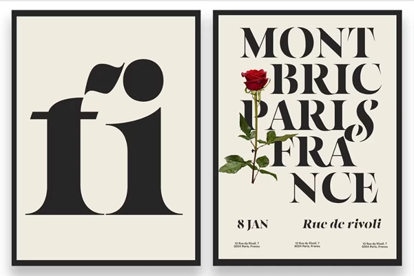
Alongside its individual weights and styles, Kiltier includes two variable fonts. These give designers another way to control the typeface without relying exclusively on predefined font instances.
The variable font format allows the weight and style to be fine-tuned for the requirements of a particular project. This can provide more precise control when a predefined weight does not produce exactly the desired visual balance.
As a result, Kiltier offers two complementary approaches to working with its type family:
14 weights in roman and italic for a broad selection of ready-to-use styles.
Two variable fonts for more flexible adjustment of weight and style.
Stylistic alternates for changing specific character forms.
Italic swashes for adding refined and artistic details.
Flexible Serif Typography for Different Design Needs
The combination of multiple weights, roman and italic styles, alternate characters, swashes, and variable fonts makes Kiltier adaptable to a variety of typographic compositions.
Its defining character comes from the balance between high-contrast serif forms, contemporary aesthetics, and timeless elegance. Designers can move between more restrained typography and more expressive treatments without leaving the same font family.
If you want the typography to stand out more, you can use the alternate characters and italic swashes to give it a more unique look. The 14 different weights also make it easy to create clear headings, subheadings, and body text while keeping the whole design consistent.
Kiltier - High Contrast Serif Font is ultimately built around typographic flexibility: a substantial range of weights for structural control, roman and italic variants for stylistic variation, alternates and swashes for character, and variable fonts for more precise adjustments.

Files Password : gfxplugin.com OR 123456